Research methodology
To properly understand the results of the study, it is first important to know a little more about the methodology that was used.
It is important that you understand the following:
- What the NPS® is and how it is measured.
- The satisfaction and importance scale and its priority matrix.
- Your organization’s position relative to competition
- The (un)agree scale and how it is interpreted.

Net Promoter Score (NPS)
The Net Promoter Score (NPS) is a widely recognized method for measuring customer enthusiasm towards an organization. It offers insight into how likely customers are to recommend a company, based on a single question: “How likely are you to recommend our organization to friends or acquaintances?” The idea is simple: enthusiastic customers are more likely to spread positive word-of-mouth and recommend your organization to others.
NPS is measured on an 11-point scale, ranging from 0 (very unlikely) to 10 (very likely). Based on their responses, customers are grouped into three categories:
- Promoters
These customers score the organization a 9 or 10. They are highly enthusiastic and actively recommend your services to others. Promoters act as ambassadors, contributing to the growth of your business by bringing in new customers and maintaining loyalty. Their enthusiasm is contagious, making them key drivers of long-term success. - Passives
Passives score a 7 or 8. These customers are satisfied but not particularly enthusiastic. While they aren’t likely to spread negative feedback, they also won’t go out of their way to promote your organization. Passives represent a middle ground – content but not fully engaged. - Detractors
Detractors give a score of 6 or lower. These customers are generally dissatisfied and are unlikely to remain loyal to your organization. Detractors pose a risk, as they are more inclined to share negative experiences with others, which can damage your reputation.
In the Netherlands, we observe noticeable differences between these three groups. It’s essential for organizations to maximize the number of promoters while minimizing detractors to foster positive growth and maintain a strong market presence.
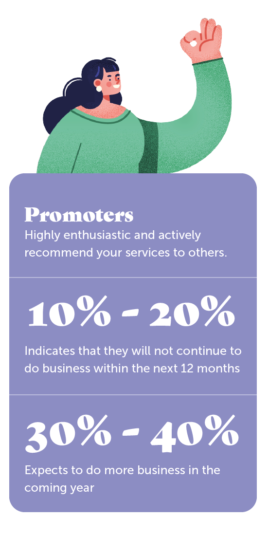
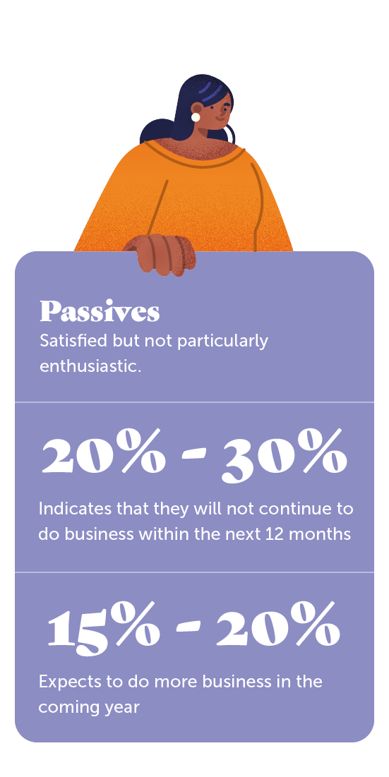
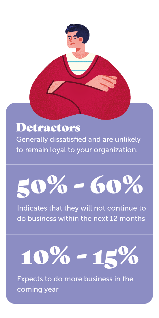
The NPS is the difference between promoters and detractors. So the NPS shows whether there are proportionally more promoters or detractors. To gain insight into the motives of recommendation behavior, a follow-through question is asked based on the answer. Want to know what a high NPS can get your organization?
Check out the ROI calculator here.
Satisfaction and importance
In the questionnaire, several items were presented to your customers. An example of an item is “customer service accessibility. These items all belong to a certain theme, for example “customer service.
A minimum of two questions were asked for each item:
- Satisfaction: What is your experience with this item?
- Importance: How important do you think this item is?
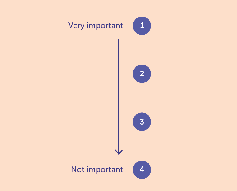
For satisfaction, a scale was used from very good to very bad. Later, these answers were converted to a score. So the scores you see in your dashboard are not literally given by customers, this is a calculation made later by Integron.
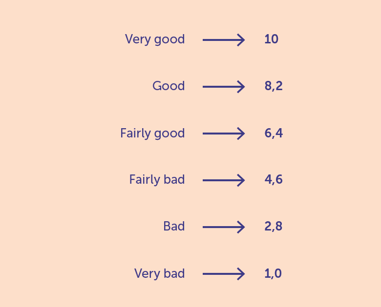
Priority Matrix
Customer satisfaction scores can be insightful, but they don’t always tell the whole story. Just because a customer is less satisfied with something doesn’t necessarily mean it’s a high-priority issue that requires immediate action. Let’s consider an example: suppose you receive a branded pen from a business partner. The pen writes well, but you don’t like the color—yellow isn’t your favorite. At the same time, you notice that contacting customer service is challenging. There are no major issues, but you’re on hold for too long, and the service representative seems unhelpful and distant.
In this scenario, a customer satisfaction survey might show that the pen is rated a 4, while customer service gets a 6. If decisions were made solely based on these scores, the company might rush to replace the yellow pens without addressing the real issue: the poor customer service. Clearly, this would miss the mark. Customer service impacts overall customer happiness far more than pen color ever could.
Some might argue, “Why not address both?” Of course, that’s possible, but in practice, improvement lists can grow quickly, often involving more significant issues than pens. How do you manage this, and where do you draw the line? The key advice is: focus on what matters most and ensure you excel at it.
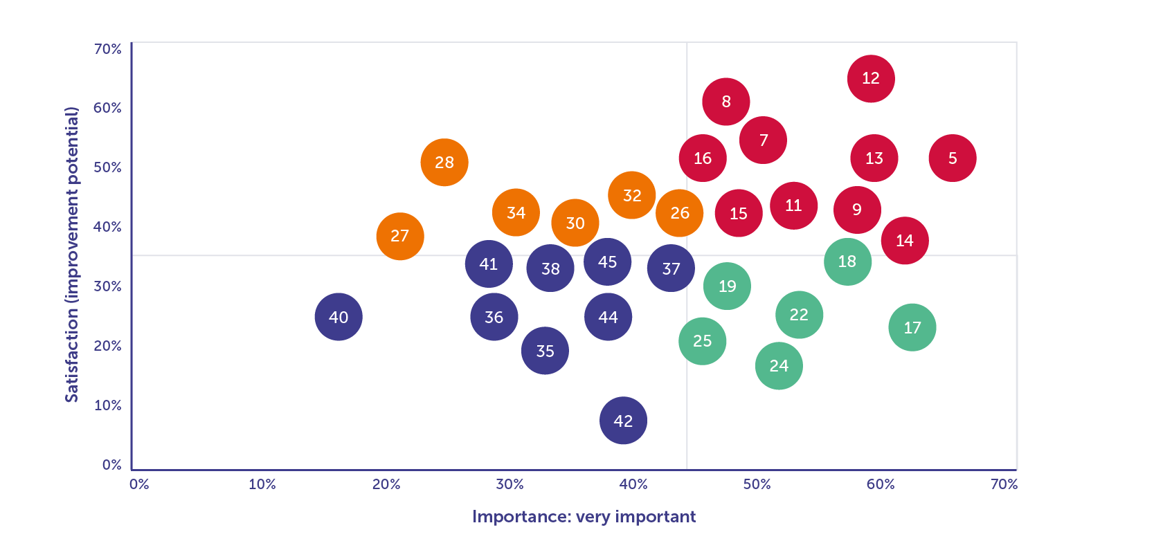
The Priority Matrix helps clarify this by visualizing two key factors: importance and improvement potential.
- Horizontal axis (Importance): As you move right, the level of importance increases. Items on the far right are considered most important by customers.
- Vertical axis (Improvement Potential): This represents the percentage of customers who feel something is bad, very bad, or has room for improvement. The higher up on the matrix, the greater the improvement potential, meaning these are areas that need attention.
In essence:
- Top of the matrix: These are areas customers believe need the most improvement.
- Bottom of the matrix: These are areas that are already performing well.
All items from the customer survey are plotted on this matrix and assigned a color based on their importance and improvement potential:
- Red: Above-average importance and high improvement potential. These are your top priorities.
- Green: Above-average importance but low improvement potential. These are your strengths, and you should maintain them.
- Orange: Below-average importance but high improvement potential. These are risks. Although less critical now, there’s room for improvement.
- Blue: Below-average importance and low improvement potential. These areas should not be a focus.
The key focus should be on the red and green areas, as these reflect what customers consider most important.
Competitive performance
The survey may have asked not only about customer satisfaction and the importance of various items but also about how your organization performs compared to competitors. Customers were given three options to describe this: better, equal, or worse.
For each item in the questionnaire (such as customer service accessibility), we can determine how your organization performs relative to competitors. We then calculate the competitive performance.
Competitive performance is measured as the percentage of customers who indicate that your organization performs “better” minus the percentage of customers who indicate that it performs “worse.” The formula is:
Competitive Performance = % Better – % Worse
A higher competitive performance indicates that you are doing better relative to the competition. We use the following scale to interpret the results:
- < 10% = No distinctiveness
- 10% – 20% = Average competitive performance
- ≥ 20% = Distinctive performance compared to competitors
(Dis)agree Scale
In some surveys, customers may be presented with various statements, often relating to the organization’s core values or image. Customers are then asked to indicate to what extent they agree or disagree with these statements. The following scale is typically used: completely agree, agree, neutral, disagree, and completely disagree.
The key question is: how should these results be interpreted, and when can a result be considered good? To evaluate this, we add up the percentages of customers who selected “completely agree” and “agree.”
- If at least 60% of customers agree (either fully or partially), it generally means the statement is well recognized by the customer base.
- If 80% or more agree, the statement is considered very well recognized.
When the percentage of agreement falls below 60%, it indicates that there’s still work to be done. The goal should ideally be to reach at least 80%, especially for statements related to the organization’s core values or image. Achieving this level of recognition ensures that these essential aspects resonate with the vast majority of your customers.